The brand kit, free to use.
These are the files that make a flyer, a slide, or a website look like it belongs with the rest of this work. They include the wordmark, its icon, names for meetups and hackathons, and the two marks for declaring an app human-shaped. Every letter in them is drawn as an outline, so they look right anywhere, even where the typeface is not installed.
- The wordmark
- The icon
- Backgrounds for calls
- Event names
- The marks
- Showing a mark
- Colors
- Typeface
- Using them well
The wordmark.
The name is two words joined by an arch where the hyphen would be, so that it reads as "human-shaped" and as the top of a person's head at the same time. Use the light version on light backgrounds and the dark version on dark ones, and use the one-color versions when something is printed in a single ink, like a flyer that will be photocopied. The PNG copies are for slide tools that will not take an SVG file.

For light backgrounds

For dark backgrounds

One color, black

One color, white
The icon.
The icon is the arch on its own, sitting high in a forest green square with the empty space below it, so that it reads as the top of a head and never as a frown. Use it where the whole name will not fit, like a profile picture, a sticker, or the corner of a slide.

The icon
Backgrounds for calls.
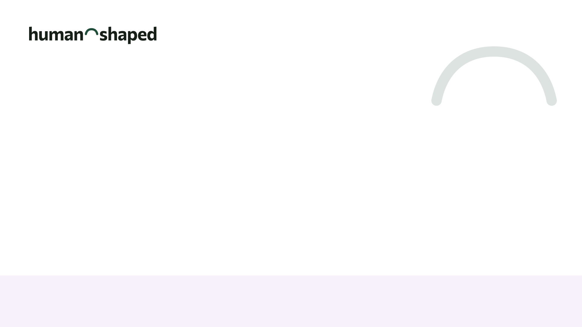
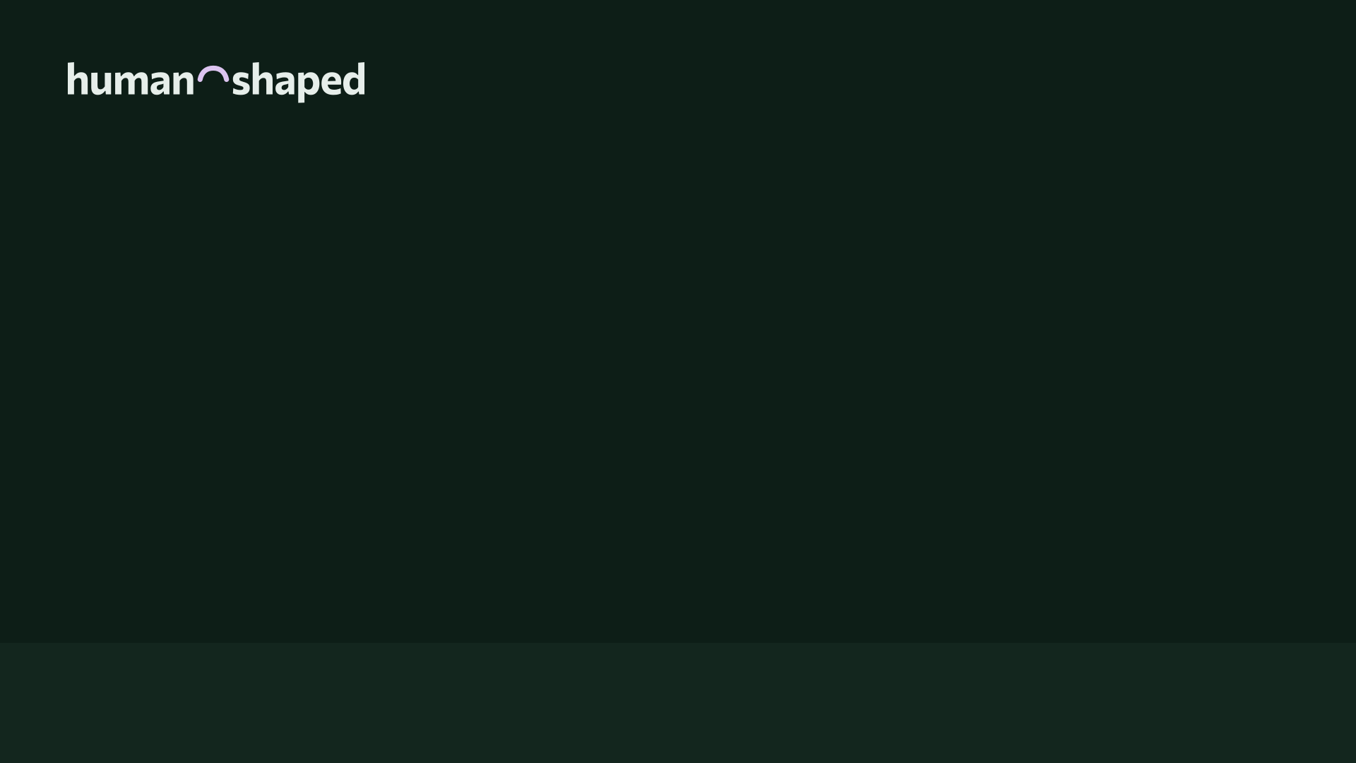
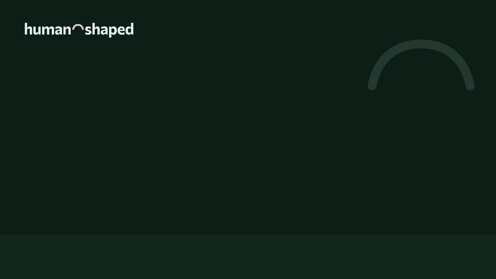
When you lead a cohort or join one, you can put one of these behind you in Google Meet, so that the call feels like it belongs to the same place as the site. The middle of each one is empty on purpose, because that is where Meet puts you, and the wordmark and the arch stay up and out of the way. In Meet, press Backgrounds and effects under your own video (or Video settings once you are in the call), and under Blur and personal backgrounds, choose Add your own personal background and pick the file you saved. Your cohort's page can also make one with your cohort's name on it.
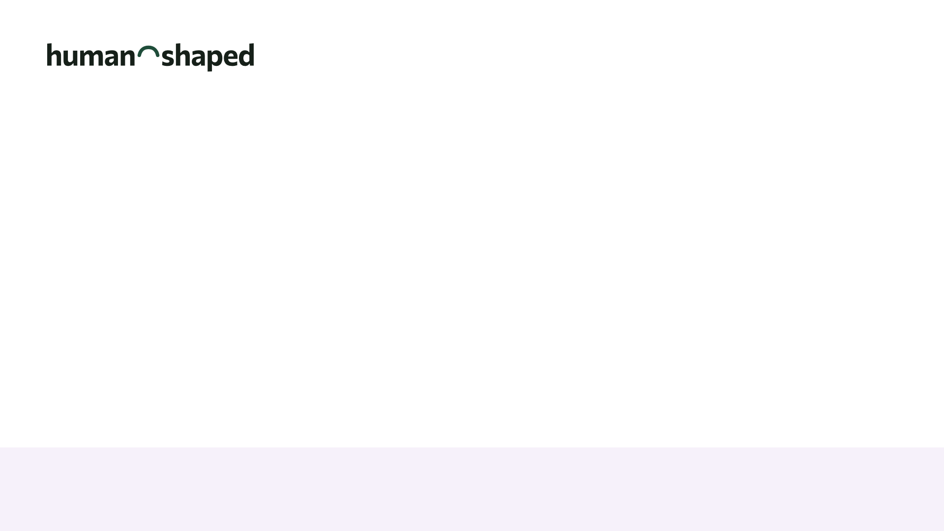
Paper
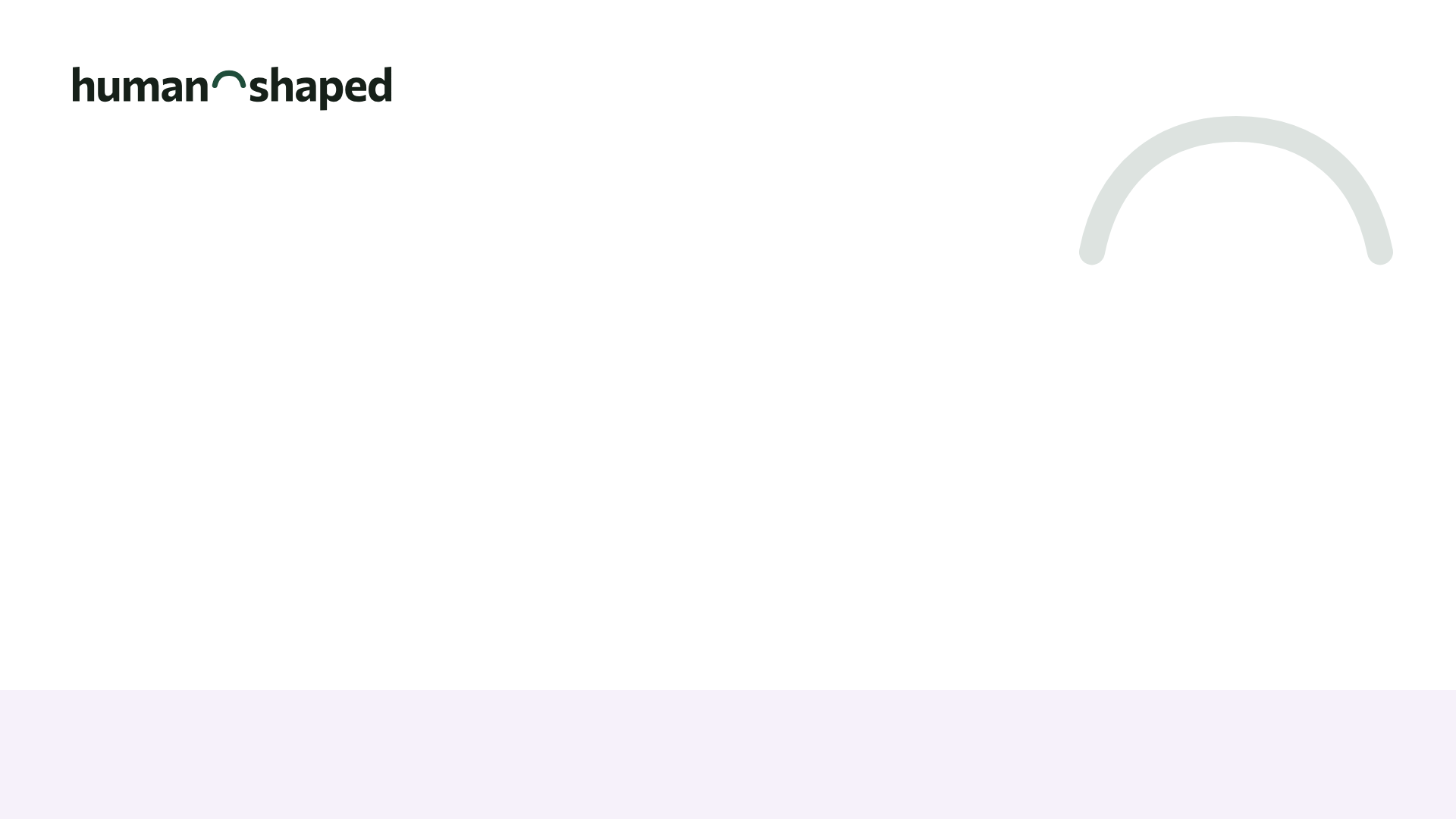
Paper, with the arch
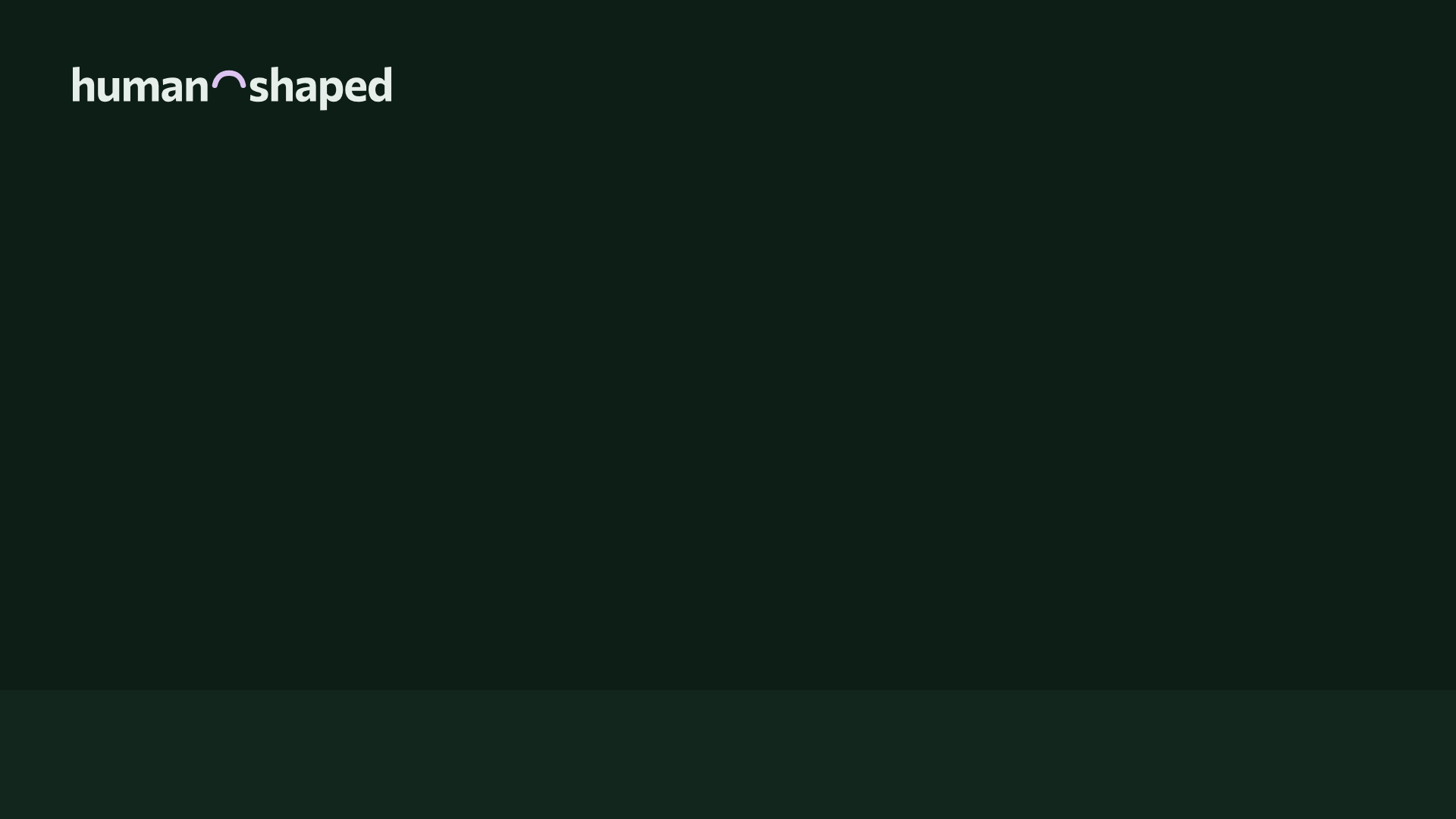
Evening
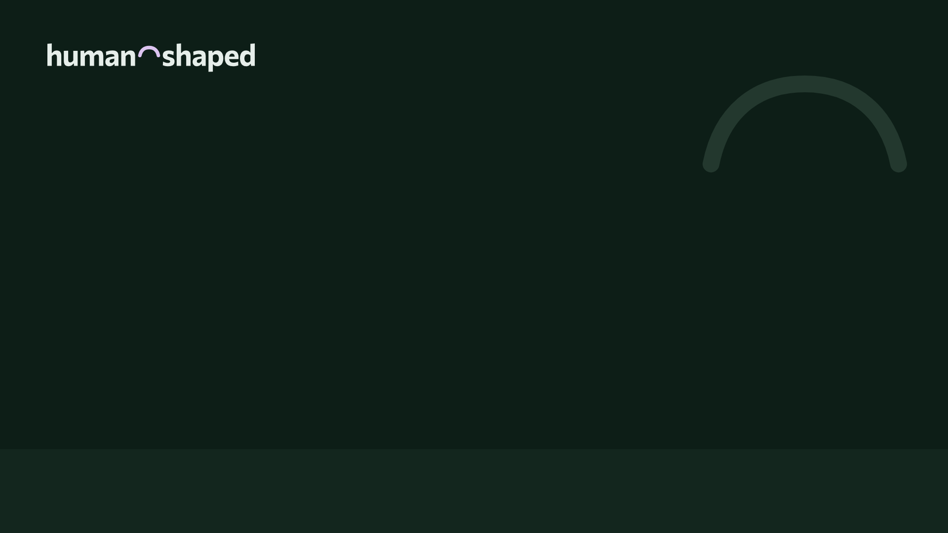
Evening, with the arch
Names for meetups and hackathons.
When you run a Human-Shaped Meetup or a Human-Shaped Hackathon, put its name on your flyer, your slides, and the sign on the door with these. You do not need to ask anyone first, as long as the principles are in front of everyone and a hackathon keeps the five things its kit names. Please do not suggest that Ben or humanshaped.org is running your event unless they are.

The marks for your software.
These two are not for events. The Human-Shaped Principles belong to anyone who builds by them, and these marks are how you say so on your software. Nobody approves either one. Each mark says something true about how your software was made, and you can use it as soon as it is true of yours.
Aligned with Human Shaped means you have written down how your software lines up with each of the fifteen principles, in a file called HUMAN-SHAPED.md in your own repository. Endorsed by Human Shaped means your software started from the Universal App Template, or you have written your commitment to the principles into your project. Either one is enough.



Showing a mark on your software.
- Read the principles against your own software, and notice the ones it does not meet yet.
- Copy HUMAN-SHAPED.md into your repository.
- For each principle, say whether your software meets it, does not meet it yet, or does not apply, in a sentence or two of your own, with a link to evidence someone else can open. Your agent can help you find the evidence, and the sentences are yours to write.
- Show the mark that is true of your software, linked to that file.
Show a mark wherever people meet your software, in its README on GitHub or at the foot of its website. The mark links to your own HUMAN-SHAPED.md, so anyone who wonders what it means can read your answers and the evidence behind them, which is what makes a mark like this worth trusting. Please keep its colors and its shape as they are, because people only learn to recognize a mark when it looks the same everywhere they see it.
Paste this where you want the mark, and change the first address to your own file. It follows the reader's light or dark setting on GitHub and on most websites. For the endorsed mark, change aligned to endorsed in both image addresses and in the alt text.
<a href="https://github.com/you/your-app/blob/main/HUMAN-SHAPED.md"><picture><source media="(prefers-color-scheme: dark)" srcset="https://humanshaped.org/assets/mark/aligned-dark.svg"><img src="https://humanshaped.org/assets/mark/aligned-light.svg" height="44" alt="Aligned with Human Shaped"></picture></a>
The colors.
Besides ink on white paper there are two colors: forest for the arch, links, and buttons, and thistle for what is current, for stickers, and for the arch on dark pages. No brand we could find uses the two together. Forest on paper has a contrast of about 9.6 to 1, forest on thistle about 6.1 to 1, and ink on paper about 16.7 to 1, so all of them clear the Web Content Accessibility Guidelines' bar of 4.5 to 1 for ordinary text, and the dark versions clear it too.
Paper
#FFFFFF
The pageInk
#162019
The wordsForest
#1F4D3A
The arch, links, and buttonsNight
#131916
The page, in darkNight ink
#E6EEEA
The words, in darkThistle
#DCC4F0
Stickers, and the arch in dark
The typeface.
Everything is set in Commissioner, designed by Kostas Bartsokas and shared under the SIL Open Font License, so it is free to install and use. The wordmark and the headings use a weight of 680, labels use 600, and reading text uses 400.
- 680, for headings and the wordmark
- Human-shaped problems are ones worth solving.
- 600, for labels
- Join a cohort
- 400, for reading text
- The ideas, the method, the tools, and the cohorts are free, and what you build is yours.
Using them well.
People only learn to recognize a mark when it looks the same everywhere they see it, so these few rules are about keeping it the same.
- The arch is the hyphen between "human" and "shaped", or it sits high in its own space, never centered low. Centered low, it reads as a frown, and high, it reads as the top of a head. If you make something new with the arch alone, put the empty space below it, the way the icon does.
- Give it room. Leave clear space around the wordmark at least as tall as its letter "n" on every side, so that nothing crowds it. The dashed line below shows how much.
- Keep it large enough to read: the wordmark at least 100 pixels wide on a screen and 25 millimeters wide in print, and the icon at least 16 pixels.
- Don't recolor it, stretch it, rebuild it in another typeface, or add shadows or outlines, and don't set it over a busy photo. If none of the versions here suits your background, use whichever one-color version has the most contrast with it.
- Write the name the same way, too: "Human Shaped" for this site and the community, "human-shaped" when it describes software, and "Human-Shaped" in the names of things, like the Human-Shaped Principles, a Human-Shaped Meetup, and a Human-Shaped Hackathon.
Where the files come from.
Every file on this page is drawn by a script from Commissioner itself (make_brand.py for the wordmark, the icon, and the event names, make_mark.py for the marks, and make_backgrounds.py for the backgrounds), so if the wordmark ever changes, the files are drawn again rather than edited by hand. Make something with them, and show us in the discussions.